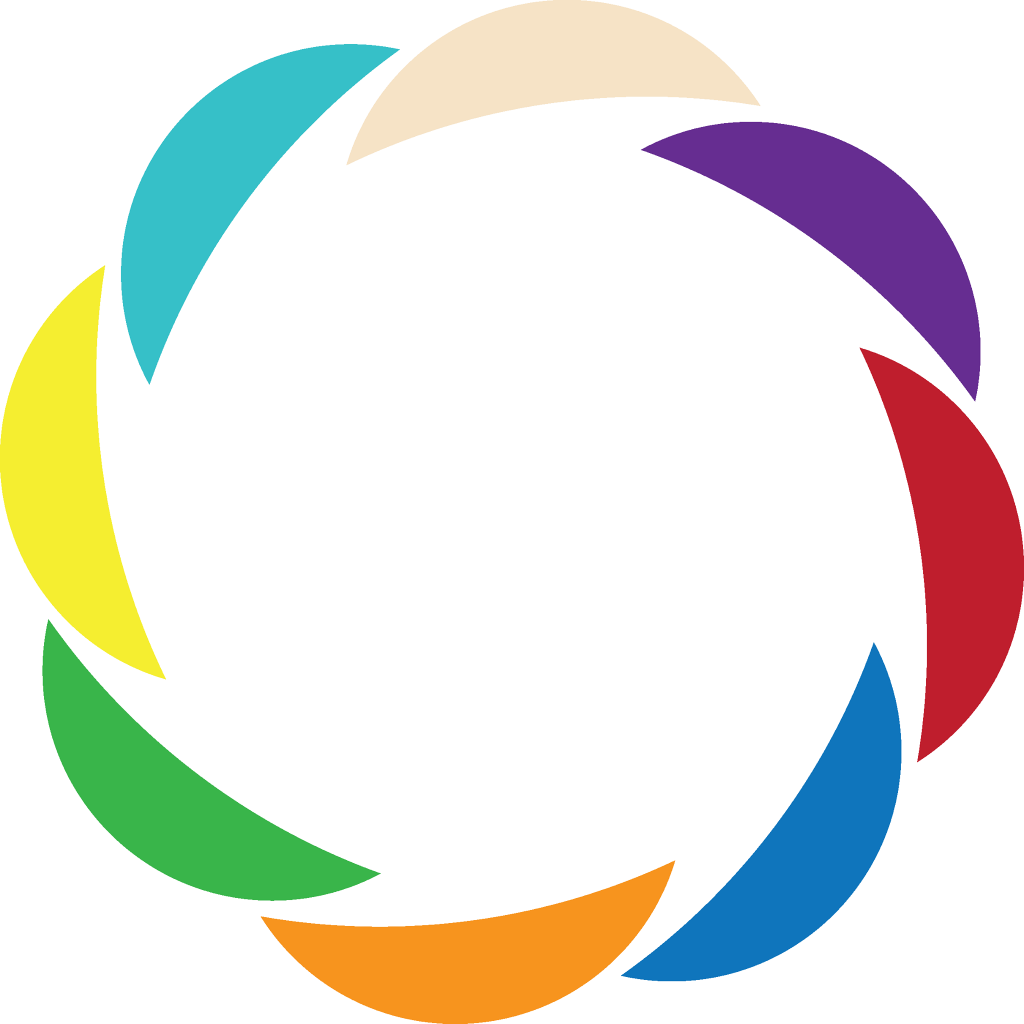
The logo of the Butterfly Communities primarily symbolizes collaboration and synergy.
It is the circle-dance of joy and integration of human diversity.
It’s a whirlpool of energy and inspiration. It is the representation of the Great Circle of Life. It is the representation of our Mother Planet.
It is also like a cell: you can see the permeable membrane that creates a protected space inside, which is open and communicates with the outside.
The number of petals and their colors is not accidental. They are the colors of Spiral Dynamics: the dance of the petals can be perceived as a ladder that helps people climb the steps of human development to the last stages of Yellow and Turquoise. Also, in Christianity, the number eight is the symbol of perfection, of the spiritual, of the fulfillment, of the Heavenly Kingdom. Also, a Butterfly Village is co-created by the cooperation of 8 Butterfly Communities.
When I conceived this logo, I had only one thing on my mind: to look like a circle. I was inspired by the movie “Raya and the Last Dragon” and the symbol by which the people worshiped the dragons (and through them the ideal of a fair and peaceful world): a circle made by the fingers of both hands raised above the head, with the head bowed in veneration.
I like to imagine that in the future millions of people, like those in the movie Raya, will feel to express their solidarity with each other and the aspiration for a more integral world through this beautiful symbol of the circle, of integrity and cooperation, made by the fingers of their hands and raised in front of the forehead. I would like an entire movement of people – who shared the same worldview of the Living Universe and the same purpose of co-creating a fairer and peaceful world – to be easily recognized by the circle symbol made by their hands and, also, by “the eight petals dancing in a circle” sign (on their flags).
